- Getting Started
-
Topics
- Wijmo
-
Chart
- Basic
-
Advanced
- Animation
- Annotations
- Conditional Formatting
- Data Labels
- Export
- Grouping and Drilldown
- Hit-Testing
- Interpolating Nulls
- Legend and Titles
- Line Markers
- Plot Areas
- Range Selectors
- Selection
- Sorting & Filtering
- Styling Series
- Toggle Series Visibility
- Tooltips
- Zooming
- Financial
- SpecialCharts
- Axes
- Analytics
- Map
- Cloud
- Gauge
- Grid
- OLAP
- Input
- Nav
- Viewer
Financial Charts
The wijmo.chart.finance.FinancialChart control supports various chart types to allow customization. Set the chartType property to change the type.
The following basic chart types are supported (common to FlexChart and FinancialChart):
- Column
- Scatter
- Line
- LineSymbols
- Area
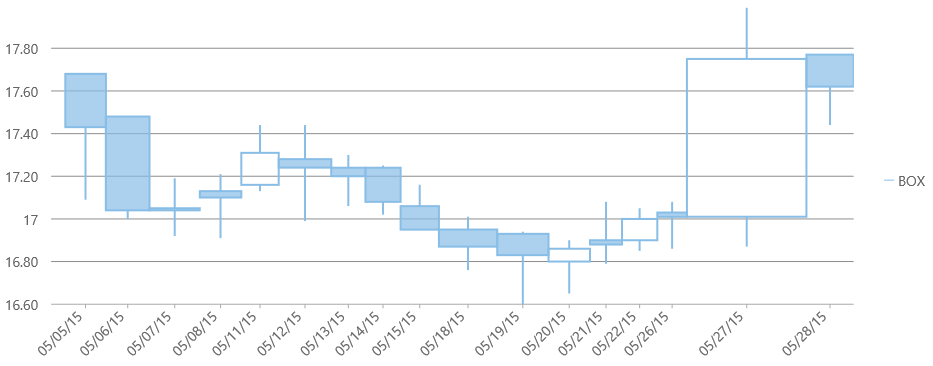
- Candlestick
- HighLowOpenClose
The following advanced financial chart types are supported:
- HeikinAshi
- LineBreak
- Renko
- Kagi
- ColumnVolume
- EquiVolume
- CandleVolume
- ArmsCandleVolume
- PointAndFigure
How to set the FinancialChart chart type:
import * as chart from '@mescius/wijmo.chart';
import * as fChart from '@mescius/wijmo.chart.finance';

var myFinancialChart = new fChart.FinancialChart('#myFinancialChart', {
    itemsSource: getAppData(),
    bindingX: 'date',
    chartType: 'HeikinAshi',
    series: [
        { binding: 'high,low,open,close' }
    ]
});
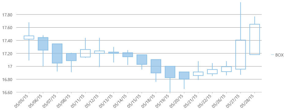
Heikin-Ashi
Heikin-Ashi charts are a variation of Japanese candlestick charts that were designed to remove noise from candlesticks and behave much like a moving average. These charts can be used to identify trends, potential reversal points, and other technical analysis patterns.
While the appearance of Heikin-Ashi charts are identical to candlestick charts, the underlying price values are calculated based on the following formulas:
- haHigh Max(high[0], haOpen[0], haClose[0])
- haLow Min(low[0], haOpen[0], haClose[0])
- haOpen Avg(haOpen[-1], haClose[-1])
- haClose Avg(high[0], low[0], open[0], close[0])
"-1" indicates the previous period; "0" indicates the current period.
These charts cannot be combined with any other series objects. The data for this chart type can be defined using the FinancialChart or FinancialSeries binding property as a comma separated value in the following format: "highProperty, lowProperty, openProperty, closeProperty".
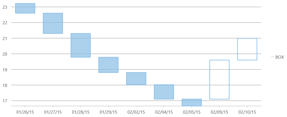
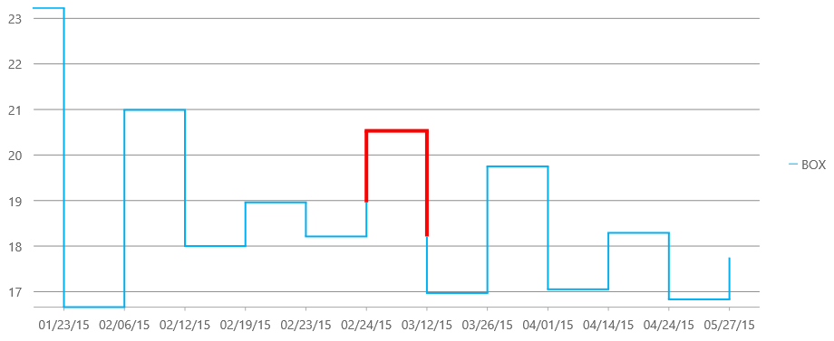
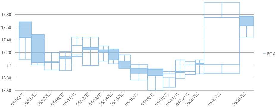
Line Break
A Line Break or Three Line Break chart uses vertical boxes or lines to illustrate the price changes of an asset or market. Movements are depicted with box colors and styles; movements that continue the trend of the previous box are colored similarly while movements that trend oppositely are indicated with a different color and/or style. The opposite trend is only drawn if its value exceeds the extreme value of the previous n number of boxes or lines, which is determined by the newLineBreaks option.
The data for this chart type can be defined using the FinancialChart or FinancialSeries binding property as a comma separated value in the following format: "highProperty, lowProperty, openProperty, closeProperty".
Setting the Number of Line Breaks
The options.lineBreak.newLineBreaks sets the number of previous boxes that must be compared before a new box is drawn in Line Break charts. The default value is 3.
Example:
myFinancialChart.options = {
  lineBreak: { newLineBreaks: 3 }
}
Styling the Line Break Chart
The Line Break chart type uses the altStyle to fill the rising values. The common style property (shared with all chart types) fills the falling values.
Example:
myFinancialChart.series[0].style = {
    stroke: 'rgb(136, 189, 230)',
    fill: 'rgba(136, 189, 230, 0.701961)'
};

myFinancialChart.series[0].altStyle = {
    stroke: 'rgb(136, 189, 230)',
    fill: 'transparent'
};
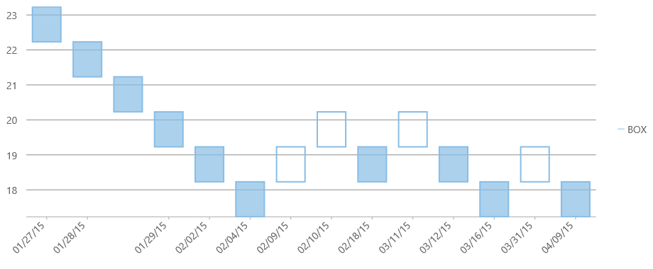
Renko
The Renko chart uses bricks of uniform size to chart the price movement. When a price moves to a greater or lesser value than the preset boxSize option required to draw a new brick, a new brick is drawn in the succeeding column. The change in box color and direction signifies a trend reversal.
The data for this chart type can be defined using the FinancialChart or FinancialSeries binding property as a comma separated value in the following format: "highProperty, lowProperty, openProperty, closeProperty".
Renko Options
Set the following settings for Renko charts in the options.
- renko.fields: Specifies the DataFields used for the Renko chart. The default value is DataFields.Close.
- renko.rangeMode: Specifies the RangeMode for the Renko chart. The default value is RangeMode.Fixed. Other options include ATR and Percentage.
- renko.boxSize: Specifies the box size for the Renko chart. The default value is 14.
Example:
myFinancialChart.options = {
  renko: {
     fields: wijmo.chart.finance.DataFields.Close,
     rangeMode: wijmo.chart.finance.RangeMode.Fixed,
     boxSize: 14
  }
}
Styling the Renko Chart
The Renko chart type uses the altStyle to fill the rising values. The common style property (shared with all chart types) fills the falling values.
Example:
myFinancialChart.series[0].style = {
    stroke: 'rgb(136, 189, 230)',
    fill: 'rgba(136, 189, 230, 0.701961)'
};

myFinancialChart.series[0].altStyle = {
    stroke: 'rgb(136, 189, 230)',
    fill: 'transparent'
};
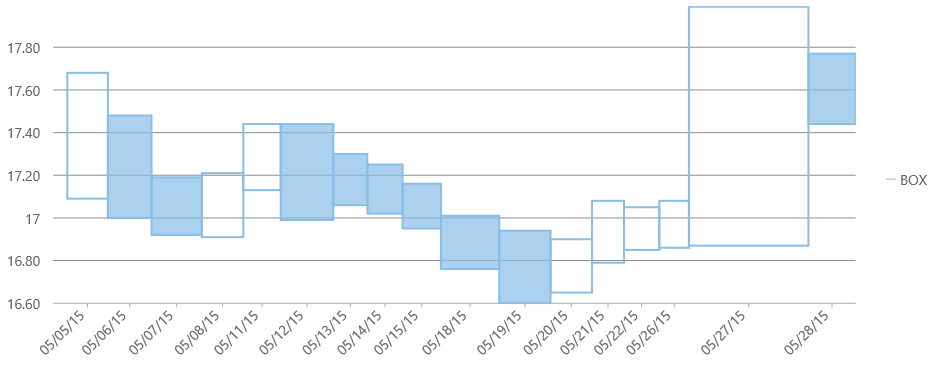
Kagi
A Kagi chart displays supply and demand trends using a sequence of linked vertical lines. The thickness and direction of the lines vary depending on the price movement. If closing prices go in the direction of the previous Kagi line, then that Kagi line is extended. However, if the closing price reverses by the preset reversal amount, a new Kagi line is charted in the next column in the opposite direction. Thin lines indicate that the price breaks the previous low (supply) while thick lines indicate that the price breaks the previous high (demand).
The data for this chart type can be defined using the FinancialChart or FinancialSeries binding property as a comma separated value in the following format: "highProperty, lowProperty, openProperty, closeProperty".
Kagi Options
Set the following settings for Kagi charts in the options.
- kagi.fields: Specifies the DataFields used for the Kagi chart. The default value is DataFields.Close.
- kagi.rangeMode: Specifies the RangeMode for the Kagi chart. The default value is RangeMode.Fixed. Other options include ATR and Percentage.
- kagi.reversalAmount: Specifies the reversal amount for the Kagi chart. The default value is 14.
Example:
myFinancialChart.options = {
  kagi: {
     fields: wijmo.chart.finance.DataFields.Close,
     rangeMode: wijmo.chart.finance.RangeMode.Fixed,
     reversalAmount: 14
  }
}
Styling the Kagi Chart
The Kagi chart type uses the altStyle to style the rising values for the ATR range mode. The common style property (shared with all chart types) styles the falling values. Since Kagi is a line chart you should set the stroke.
Example:
myFinancialChart.series[0].style = {
    stroke: 'rgb(136, 189, 230)'
};

myFinancialChart.series[0].altStyle = {
    stroke: 'red'
};
ColumnVolume
ColumnVolume charts are similar to Column charts, except that they accept a second value, volume, which dictates the width of each bar.
The data for this chart type can be defined using the binding property as a comma separated value in the following format: "yProperty, volumeProperty". Only one set of volume data is currently supported per FinancialChart.
Example:
import * as fChart from '@mescius/wijmo.chart.finance';

var myFinancialChart = new fChart.FinancialChart('#myFinancialChart', {
    itemsSource: getAppData(),
    bindingX: 'date',
    chartType: 'ColumnVolume',
    series: [
        { binding: 'close,volume' }
    ]
});
EquiVolume
EquiVolume charts are similar to Candlestick charts, but they only show the high and low values. In addition, the width of each bar is determined by a fifth value, volume.
The data for this chart type can be defined using the binding property as a comma separated value in the following format: "highProperty, lowProperty, openProperty, closeProperty, volumeProperty". Only one set of volume data is currently supported per FinancialChart. The EquiVolumn chart type uses the altStyle to fill the rising values.
Example:
import * as fChart from '@mescius/wijmo.chart.finance';

var myFinancialChart = new fChart.FinancialChart('#myFinancialChart', {
    itemsSource: getAppData(),
    bindingX: 'date',
    chartType: 'EquiVolume',
    series: [
        { binding: 'high,low,open,close,volume' }
    ],
    altStyle: {
        stroke: 'rgb(136, 189, 230)',
        fill: 'transparent'
    }
});
CandleVolume
andleVolume charts are identical to standard Candlestick charts, except that the width of each bar is determined by a fifth value, volume.
The data for this chart type can be defined using the binding property as a comma separated value in the following format: "highProperty, lowProperty, openProperty, closeProperty, volumeProperty". The CandleVolumn chart type uses the altStyle to fill the rising values.
Example:
import * as fChart from '@mescius/wijmo.chart.finance';

var myFinancialChart = new fChart.FinancialChart('#myFinancialChart', {
    itemsSource: getAppData(),
    bindingX: 'date',
    chartType: 'CandleVolume',
    series: [
        { binding: 'high,low,open,close,volume' }
    ],
    altStyle: {
        stroke: 'rgb(136, 189, 230)',
        fill: 'transparent'
    }
});
Arms CandleVolume
Created by Richard Arms, Arms CandleVolume charts are a combination of EquiVolume and CandleVolume charts.
The data for this chart type can be defined using the binding property as a comma separated value in the following format: "highProperty, lowProperty, openProperty, closeProperty, volumeProperty". The ArmsCandleVolumn chart type uses the altStyle to fill the rising values.
Example:
import * as fChart from '@mescius/wijmo.chart.finance';

var myFinancialChart = new fChart.FinancialChart('#myFinancialChart', {
    itemsSource: getAppData(),
    bindingX: 'date',
    chartType: 'ArmsCandleVolume',
    series: [
        { binding: 'high,low,open,close,volume' }
    ],
    altStyle: {
        stroke: 'rgb(136, 189, 230)',
        fill: 'transparent'
    }
});
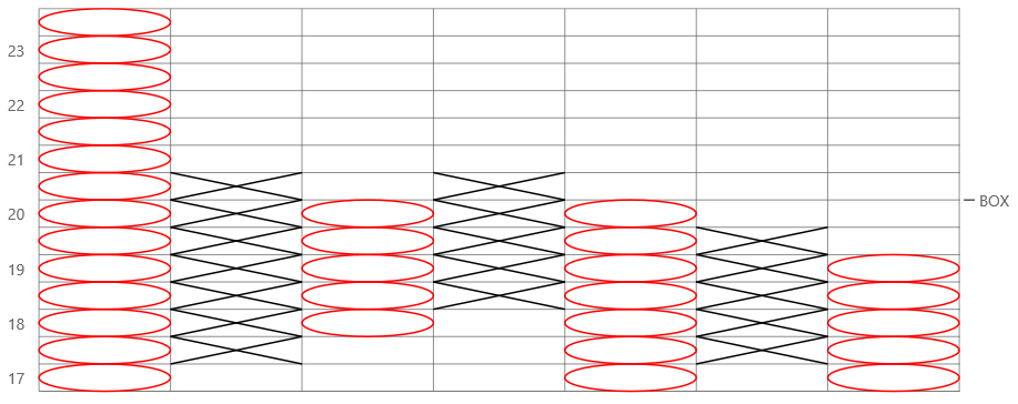
Point & Figure
Point and Figure chart consists of columns of X's and O's that represent filtered price movements. X-Columns represent rising prices and O-Columns represent falling prices.
The data for this chart type can be defined using the binding property as a comma separated value in the following format: "highProperty, lowProperty, closeProperty". The PointAndFigure chart type uses the altStyle to color the alternate values.
Example:
import * as fChart from '@mescius/wijmo.chart.finance';

var myFinancialChart = new fChart.FinancialChart('#myFinancialChart', {
    itemsSource: getAppData(),
    bindingX: 'date',
    chartType: 'PointAndFigure',
    series: [
        { binding: 'high,low,close' }
    ],
    style: {
        stroke: 'black'
    },
    altStyle: {
        stroke: 'red'
    }
});
Point & Figure Options
Set the following settings for PointAndFigure charts in the options.
- pointAndFigure.fields: Specifies the DataFields used for the point & figure chart. The default value is DataFields.Close.
- pointAndFigure.reversal: Specifies the reversal amount for the point & figure chart. The default value is 3.
- pointAndFigure.scaling: Traditional, Fixed, or Dynamic scaling mode.
- Traditional: The box size is calculated automatically based on price range.
- Fixed: The box size is defined by boxSize property.
- Dynamic: The box size is calculated based on ATR.
Example:
myFinancialChart.options = {
  kagi: {
     fields: wijmo.chart.finance.DataFields.Close,
     scaling: wijmo.chart.finance.PointAndFigureScaling.Fixed,
     reversal: 3
  }
}